01
UX research & journey mapping
Interviews, analytics review and journey maps that expose where users hesitate, stall or give up.

ServiceWeb Challengers
Research-informed UX and polished UI that turns tangled journeys into clear, build-ready interfaces — designed with engineering reality in view, never in isolation.
Beautiful designs that ignore data structures, empty states and edge cases are where projects go to die. Because we are a development company first, every screen we design is checked against the real data and states behind it — the empty dashboard, the validation error, the slow connection.
Our process is research first, pixels second. We interview users, watch where journeys stall, and agree the information each screen must carry before any colour is chosen. The visual layer then makes those decisions obvious rather than decorating guesses.
Handover is a deliverable, not a zip file. You receive a component library with documented states, tokens for spacing and colour, and annotation for behaviour — so whichever team builds it, the result matches the design without a game of telephone.
Journeys mapped from real user research, not assumption
Every state designed: empty, error, loading, edge case
Design systems that keep future screens consistent
Handover documented so development matches the design
Pick the depth you need — a focused UX sprint or a complete design system for a product.
Interviews, analytics review and journey maps that expose where users hesitate, stall or give up.
Low-fidelity structure for every screen and state, agreed before any visual design begins.
High-fidelity screens in your brand — typography, spacing and components chosen for clarity.
Clickable flows that let stakeholders and test users experience the journey before build.
Reusable components with documented states, tokens and usage rules that keep a growing product consistent.
Annotated files, tokens and a walkthrough session — so the build matches the design, screen for screen.
Real project patterns connected to this service, solution or industry experience.
View all case studies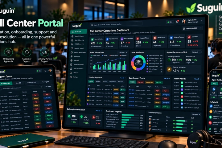
A Vue.js operations portal for store verification and onboarding, document/KYC approval, customer support, refunds, delivery-partner assistance, escalations and support-team visibility.
View case study↗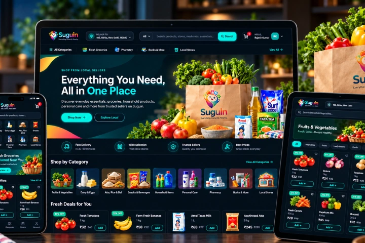
A responsive Vue.js marketplace for local shopping across groceries and everyday products, with search, categories, product detail, cart, checkout, account and order flows connected to the Suguin platform.
View case study↗Design decisions get cheaper the earlier they're made — our sequence puts the cheap decisions first.
Users, analytics and stakeholder goals distilled into journey maps and a prioritised list of design problems.
Wireframes for every state, reviewed and agreed — this is where the project's real quality is decided.
Brand-true UI applied to the agreed structure, with components designed as a reusable system.
Documented components and a walkthrough for the build team — then we stay available during development.
Support tickets, abandoned carts, heatmaps, three honest user interviews — rough evidence beats confident opinion. It tells us what to fix first and protects the project from the loudest stakeholder redesigning everything around personal taste.
Screen-by-screen design produces apps that drift — five button styles by version three. Designing a component system first costs marginally more upfront and repays it on every future screen, which is why we default to it.
Straight answers about how this work is scoped, delivered and supported.
Ask something else →Yes — often starting with a UX review that identifies the highest-impact fixes, so improvement is staged rather than a wholesale throwaway of what works.
Yes, with component libraries, tokens and prototypes — structured so any capable development team can build from them accurately.
That's our natural mode — design and engineering under one roof removes the classic handover gap entirely.
WCAG 2.2 is designed in from the wireframe stage — contrast, focus states, touch targets and screen-reader flow — not audited in at the end.
Point us at the screens where users hesitate or drop off. We will trace the cause and show you what a clearer version looks like.
Discuss your design project ↗